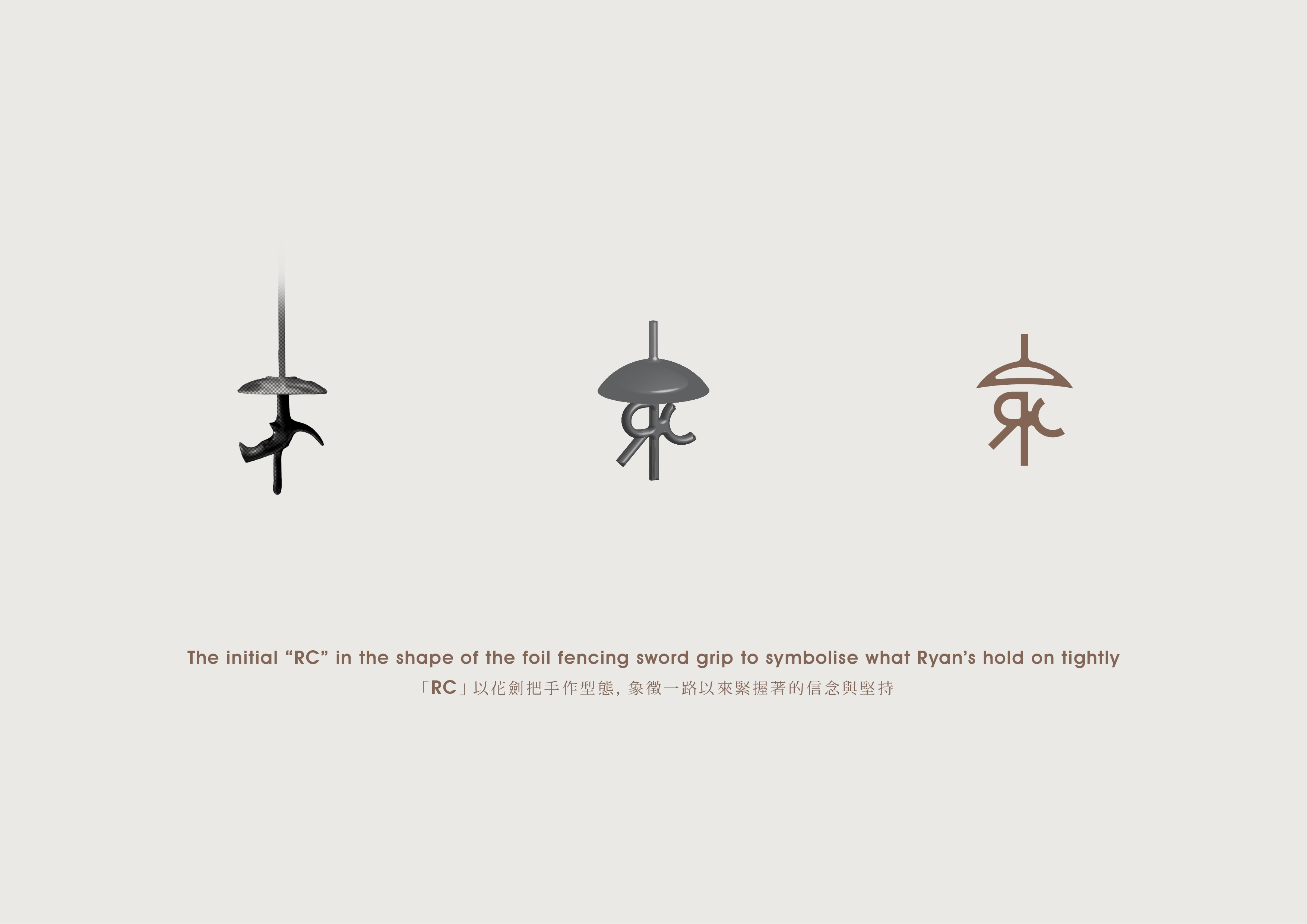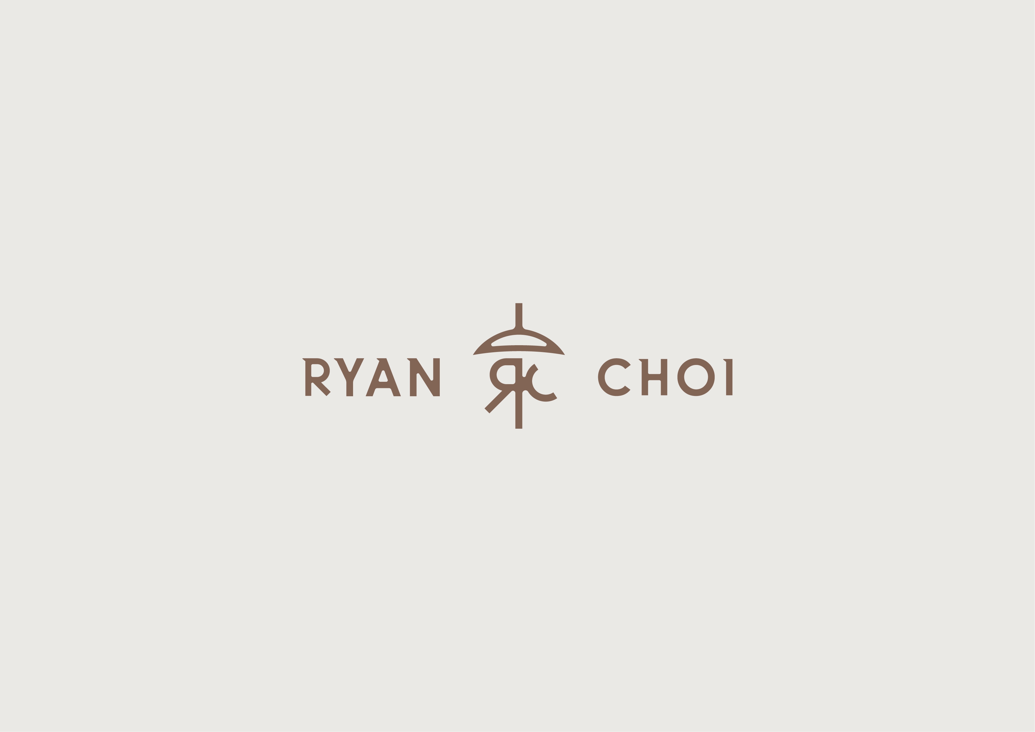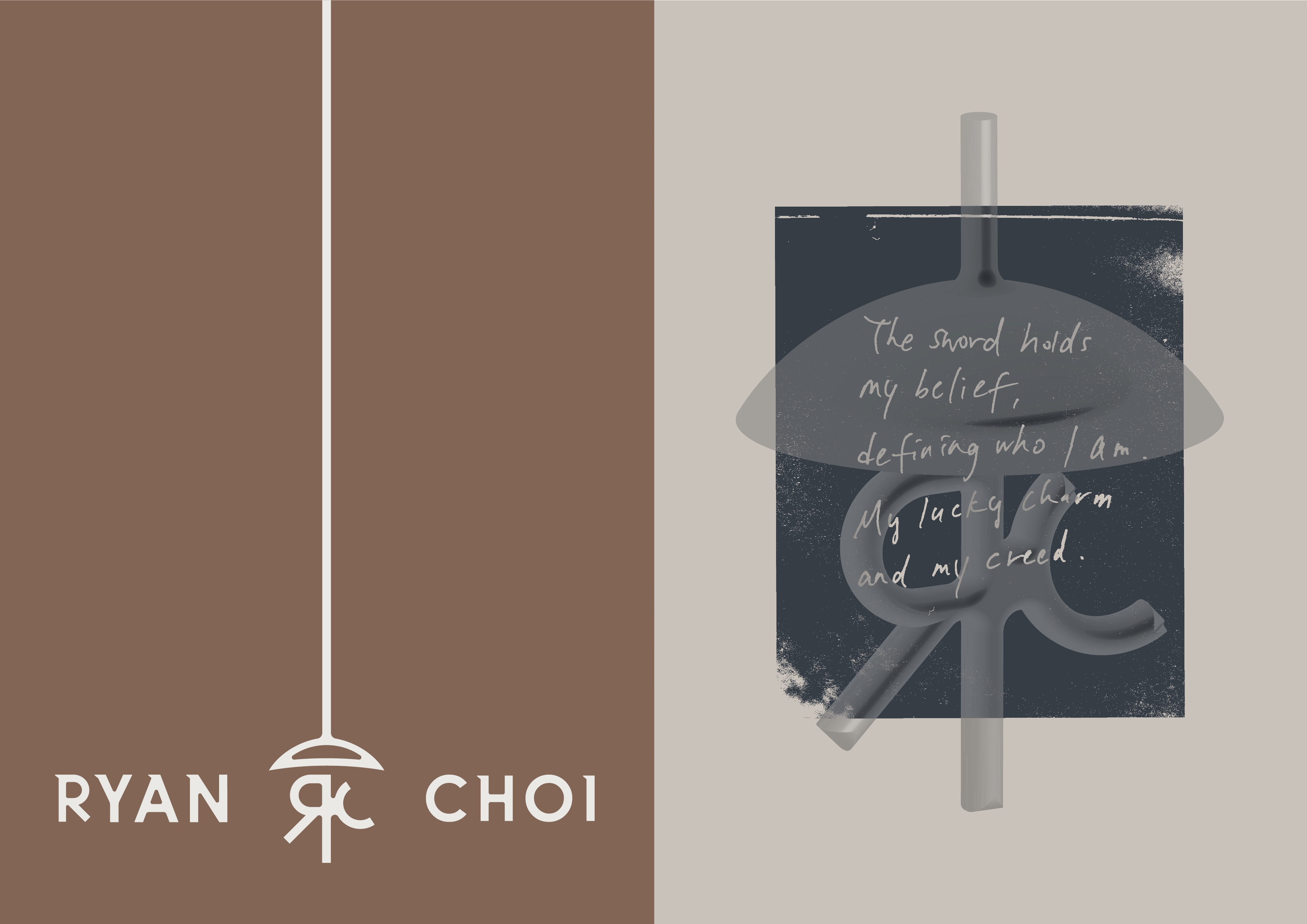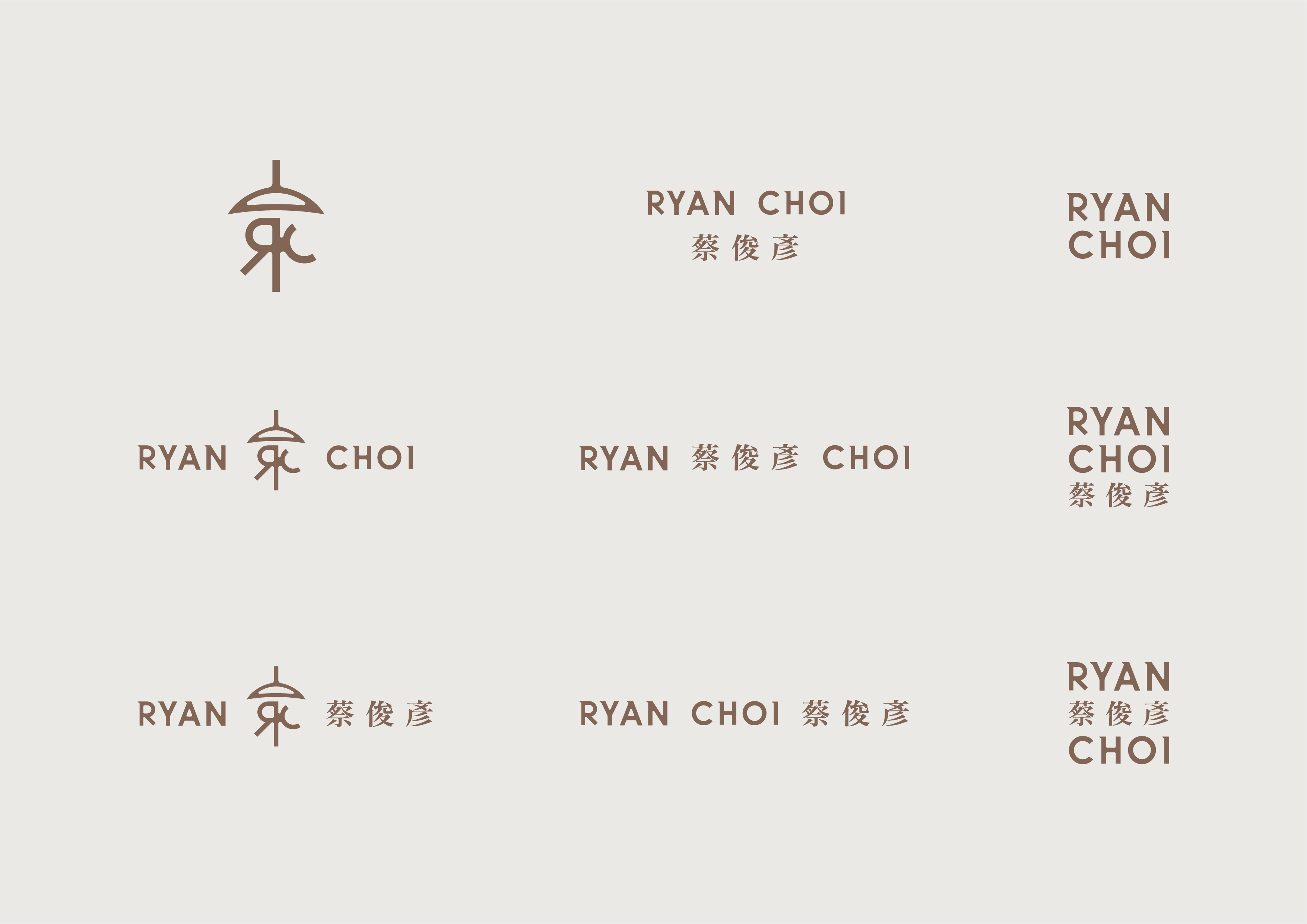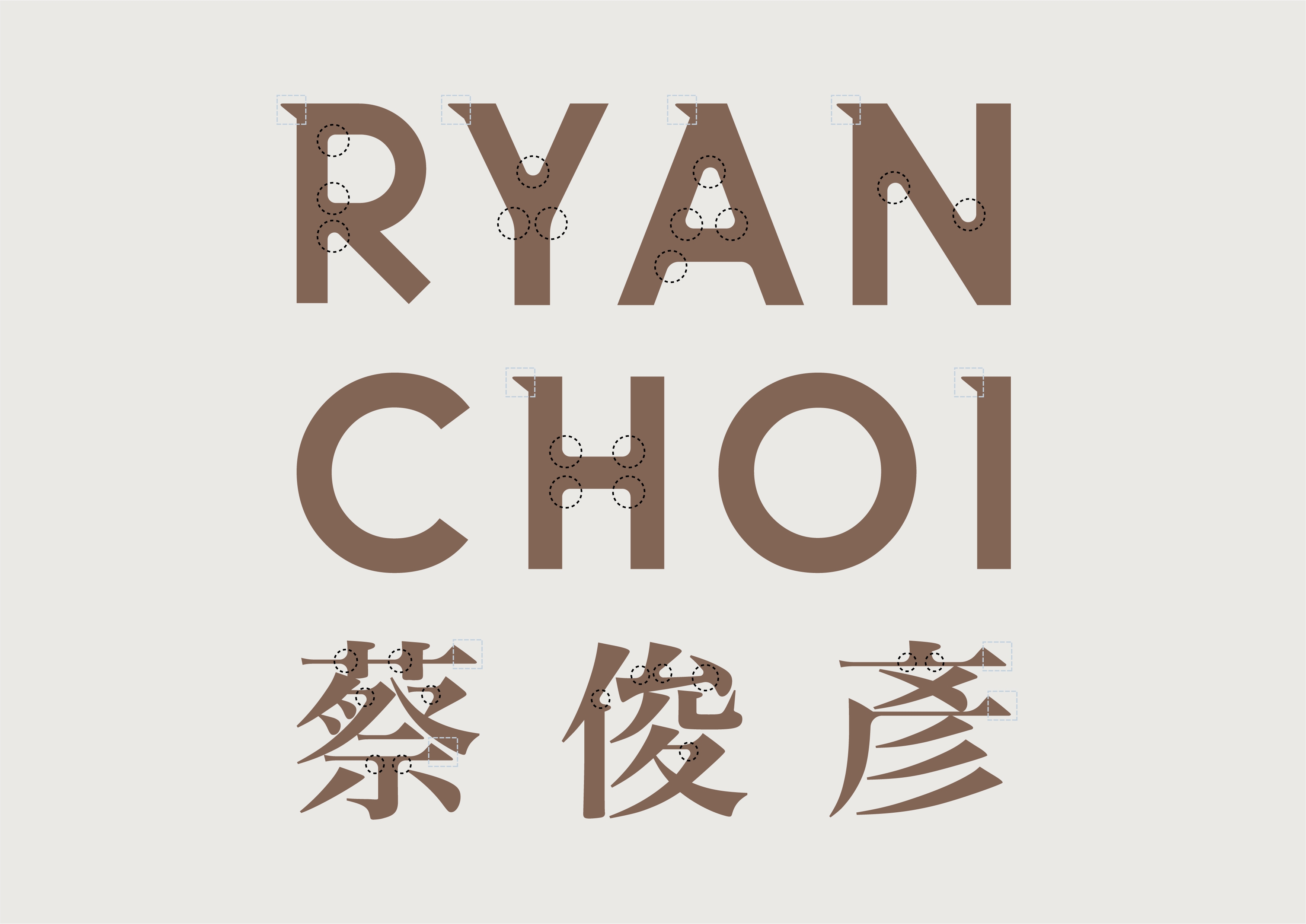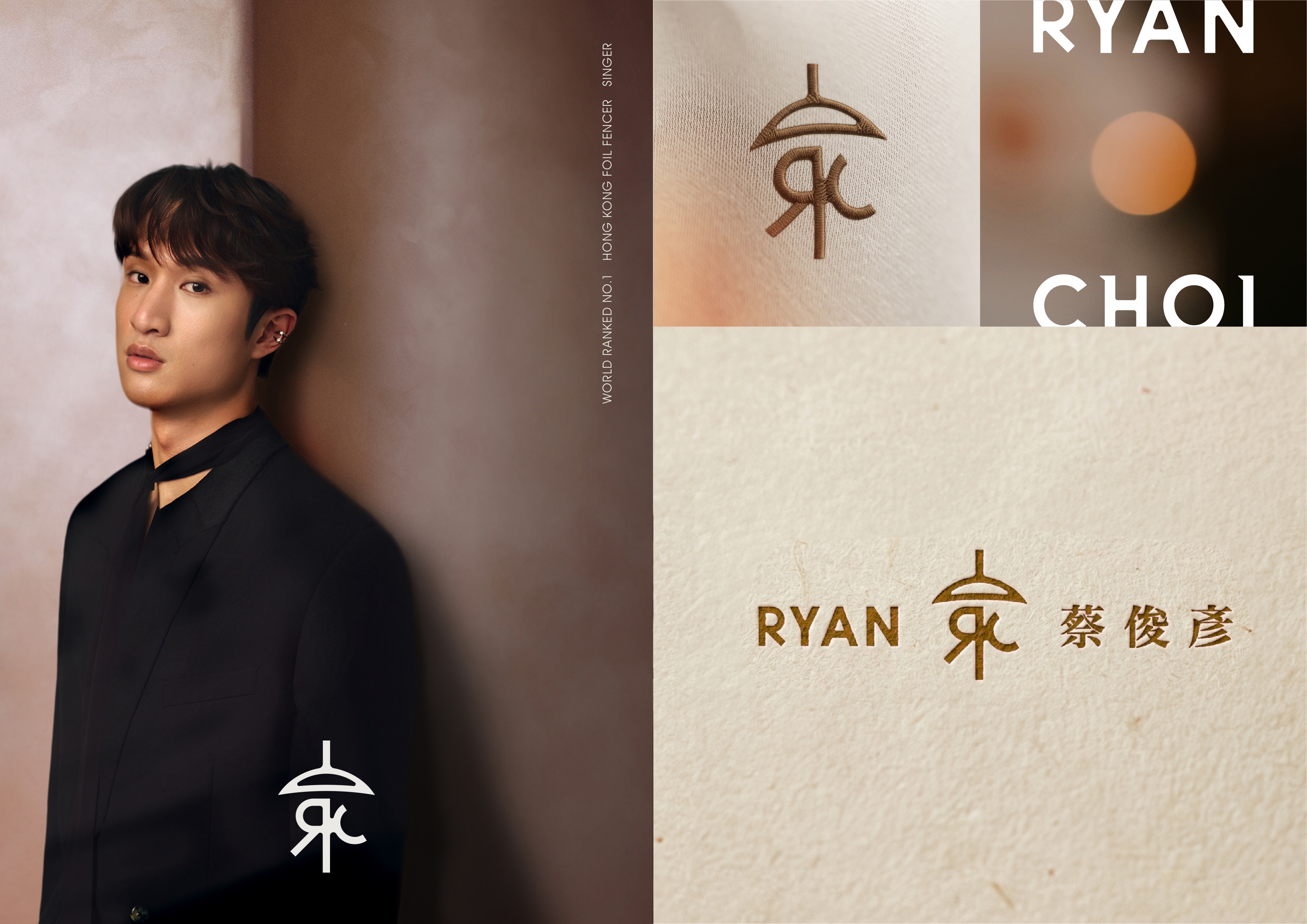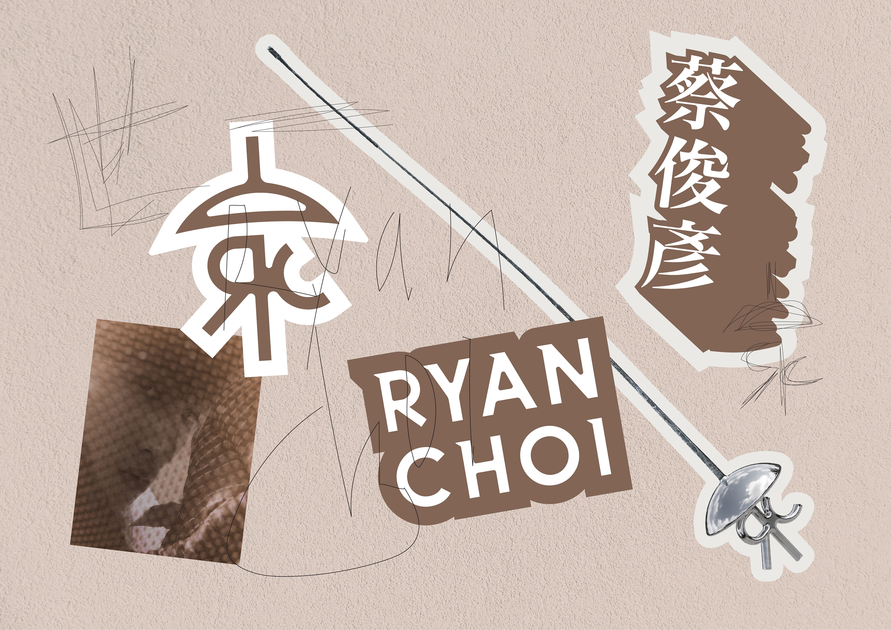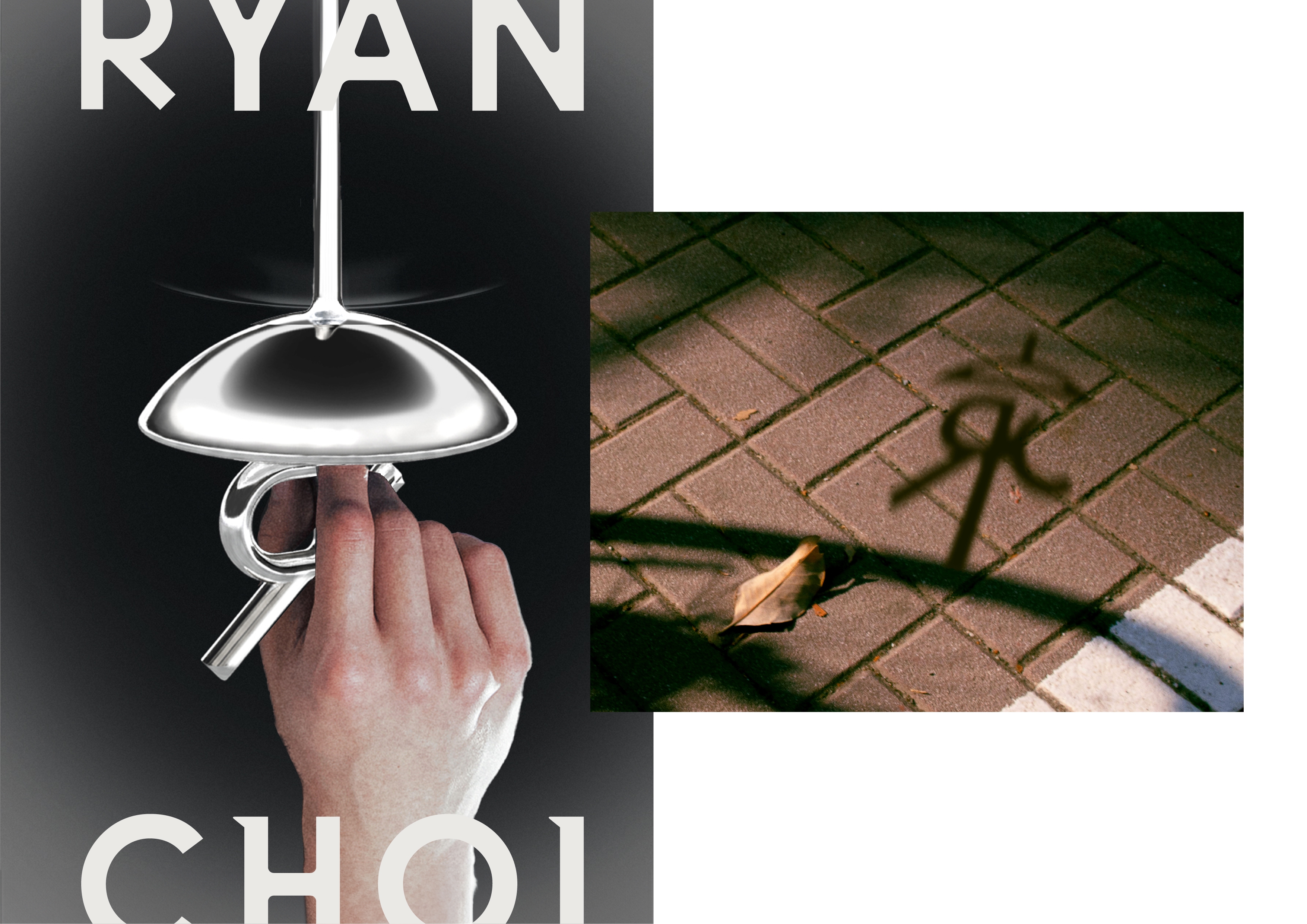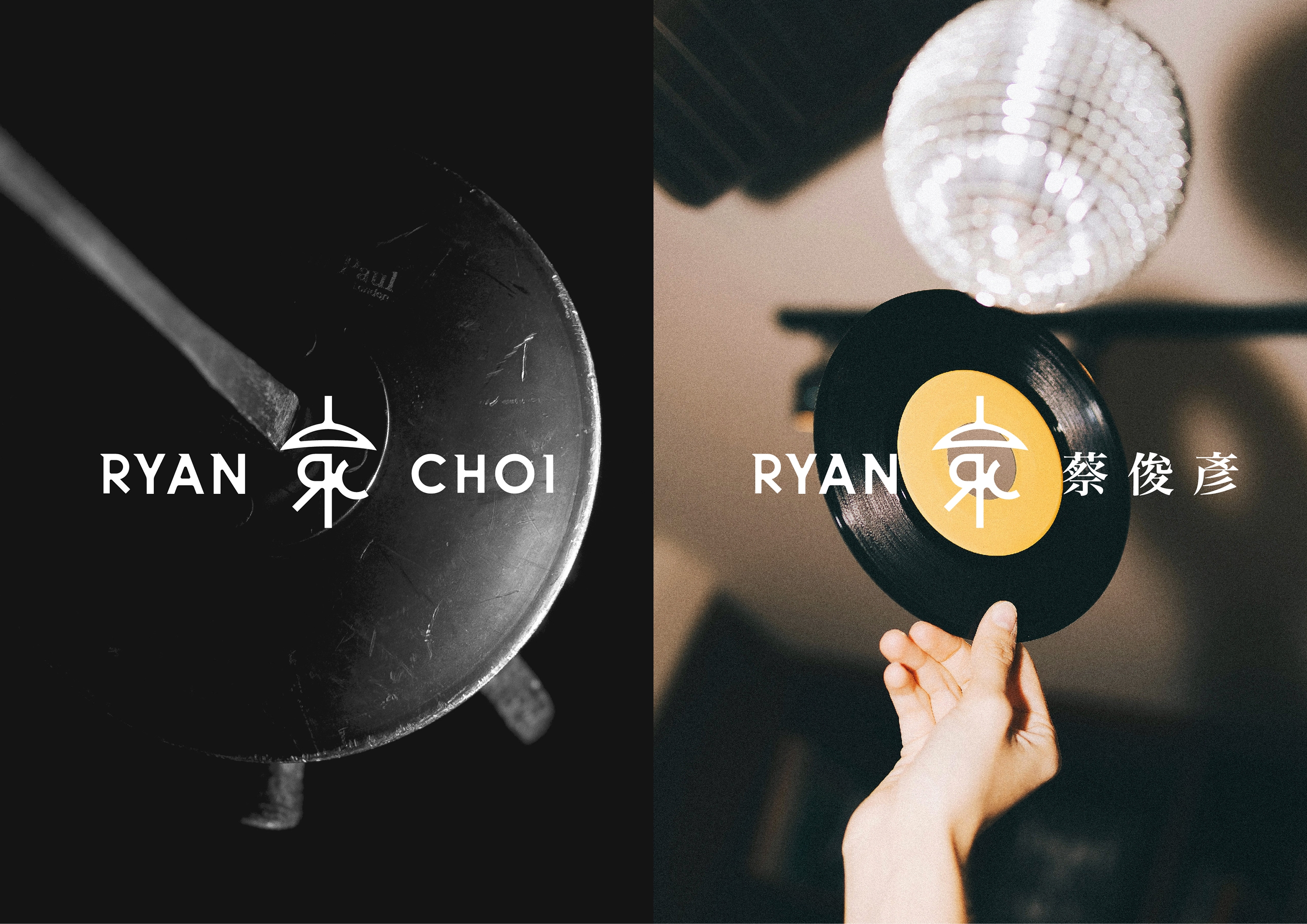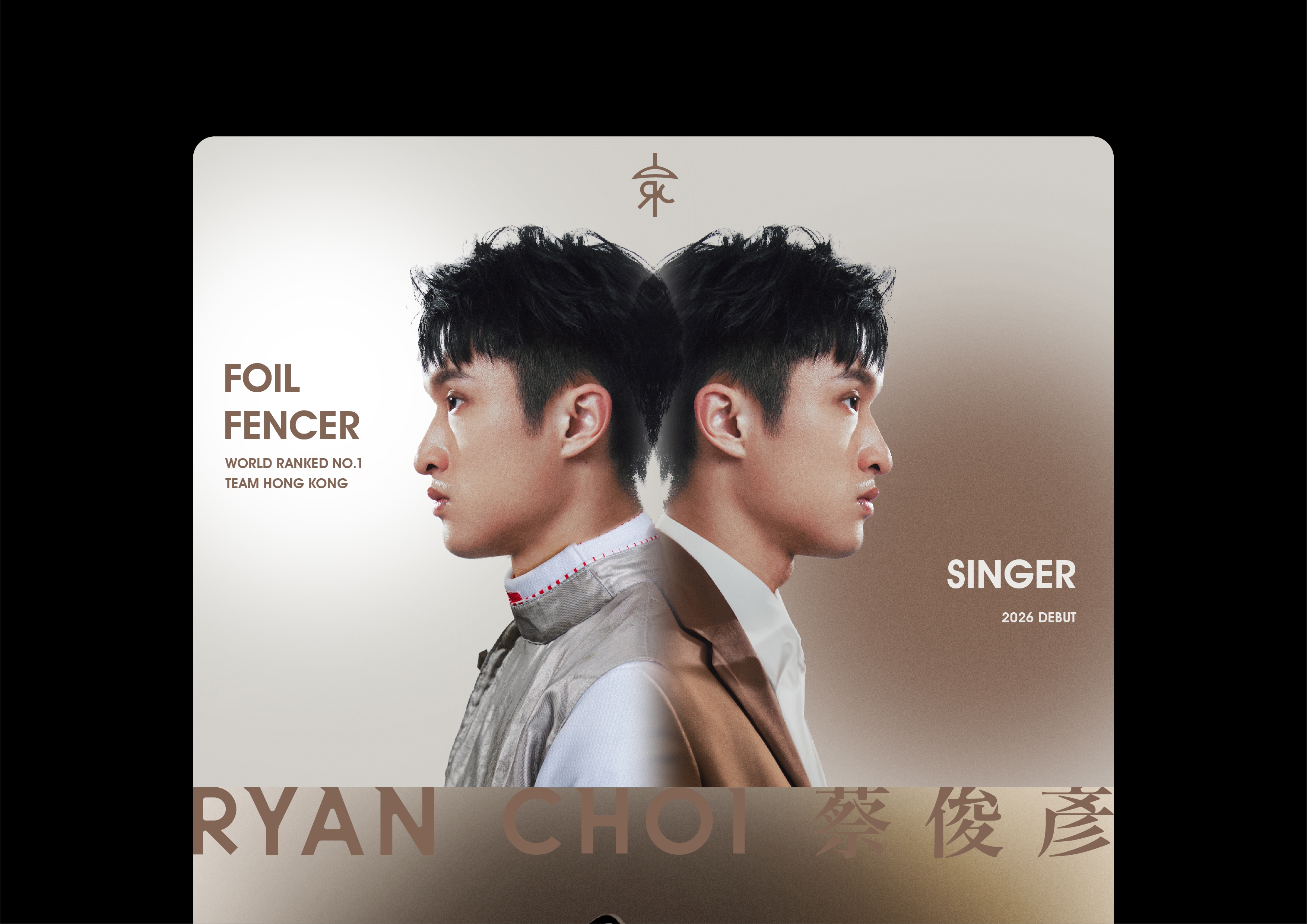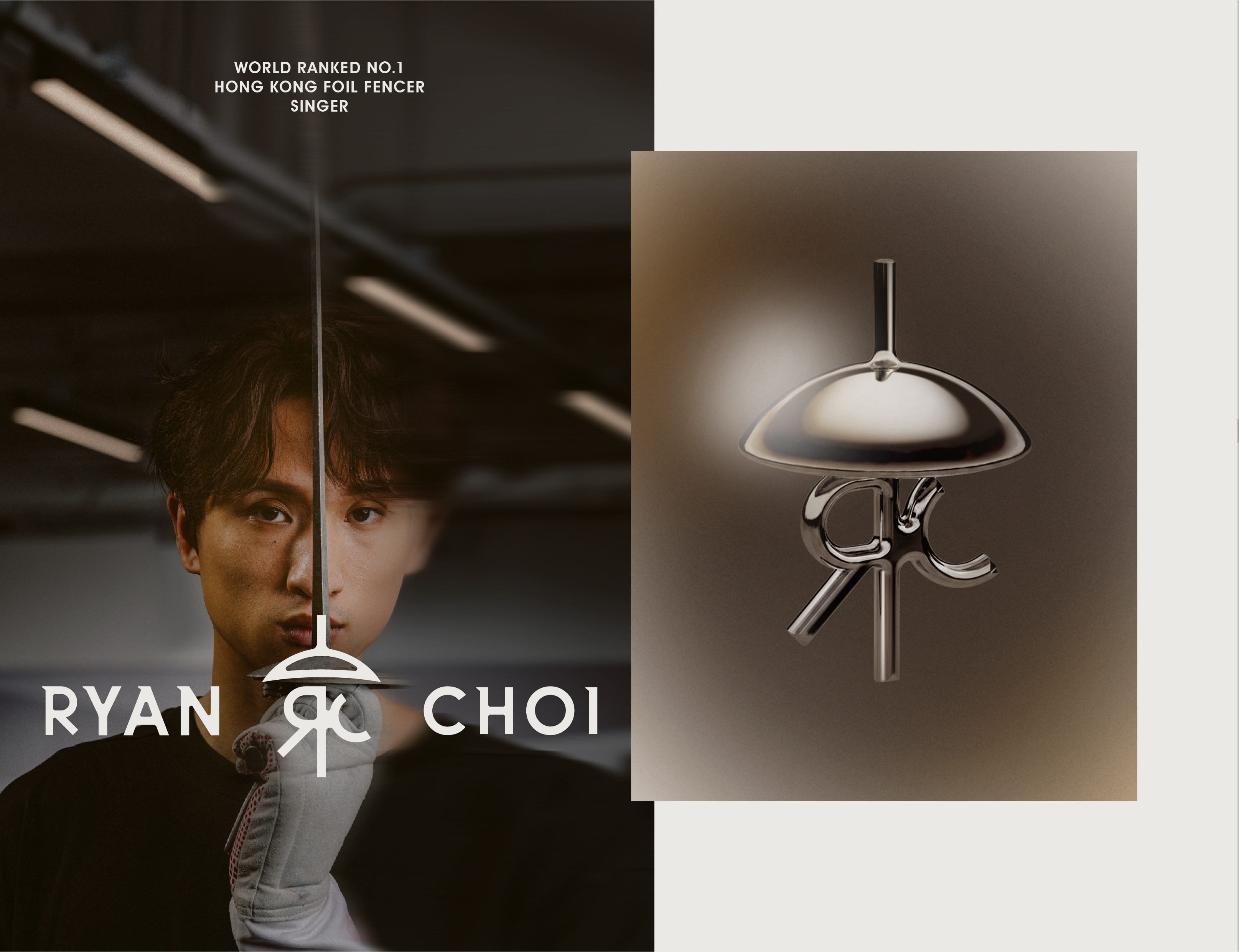
The Sword of Creed Ryan Choi is a Hong Kong foil fencer with a world ranked no.1, and also started to become a singer in 2026. His logo design incorporates his initial “RC”, in the shape of the foil fencing sword grip to symbolise what Ryan’s hold on tightly. It’s his belief, defining who he is, his lucky charm and creed. The typography is in a a mix of serif and sans serif style, symbolising both the dynamic and static that defining Ryan. The brown colour tone gives a sensual and sophisticated side of Ryan. The overall brand tone is giving a confident, powerful and stylish feeling.