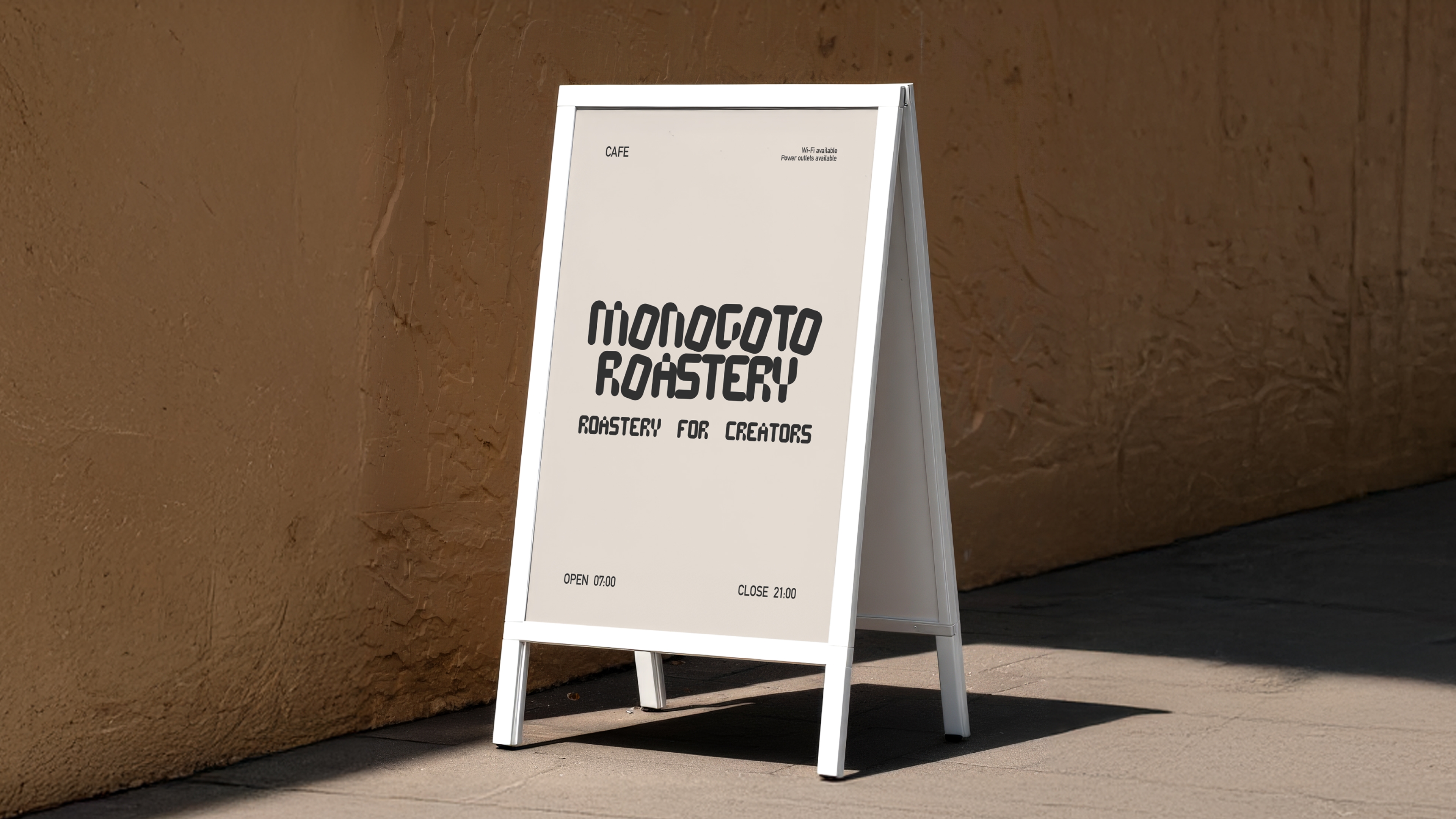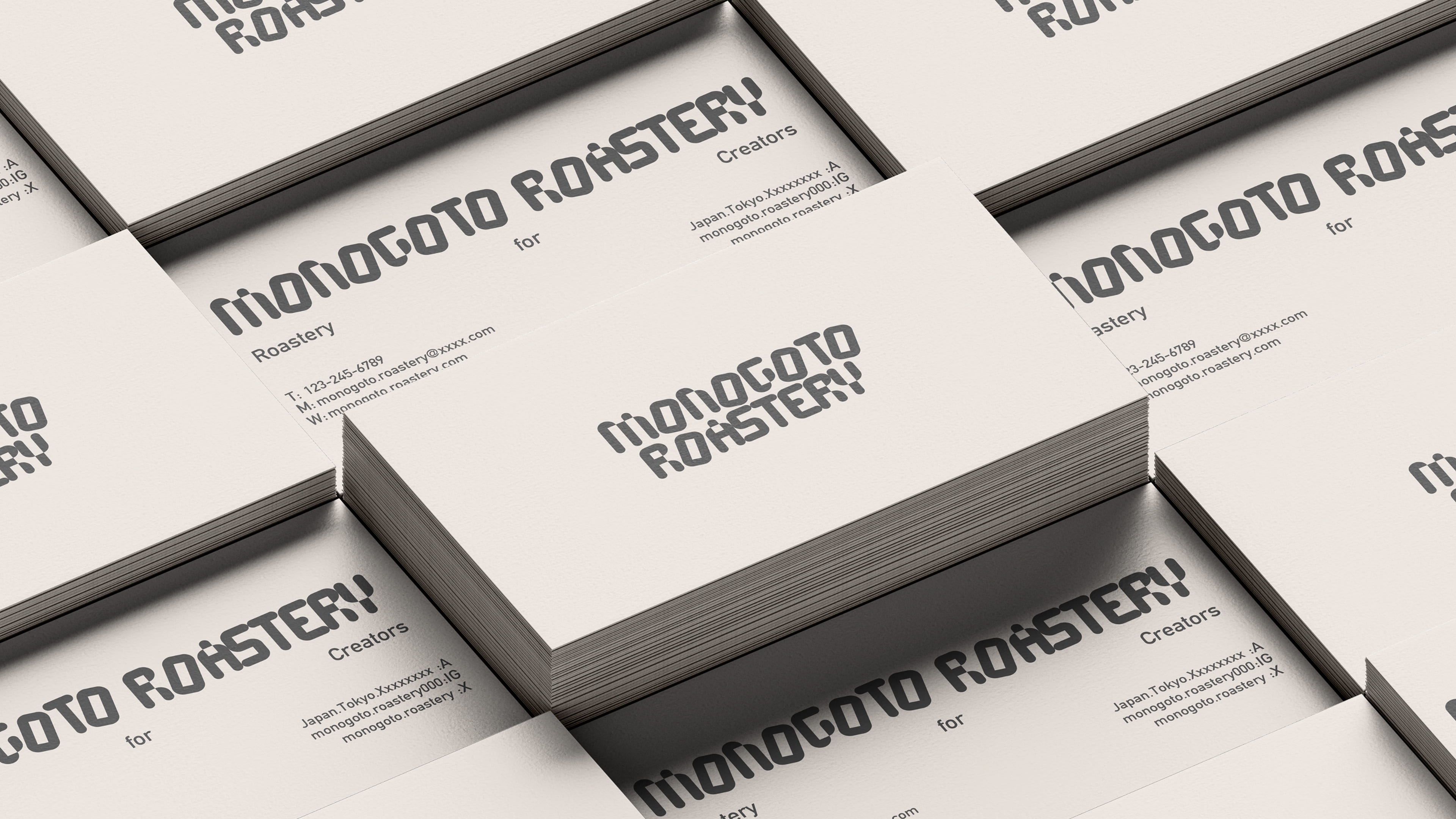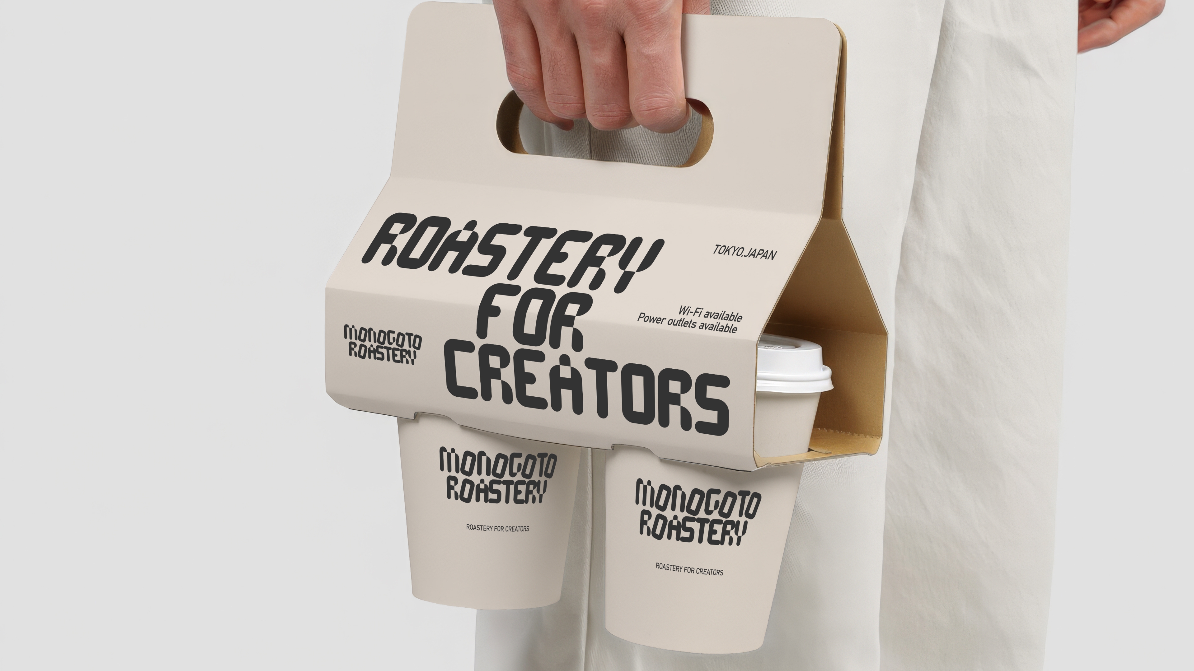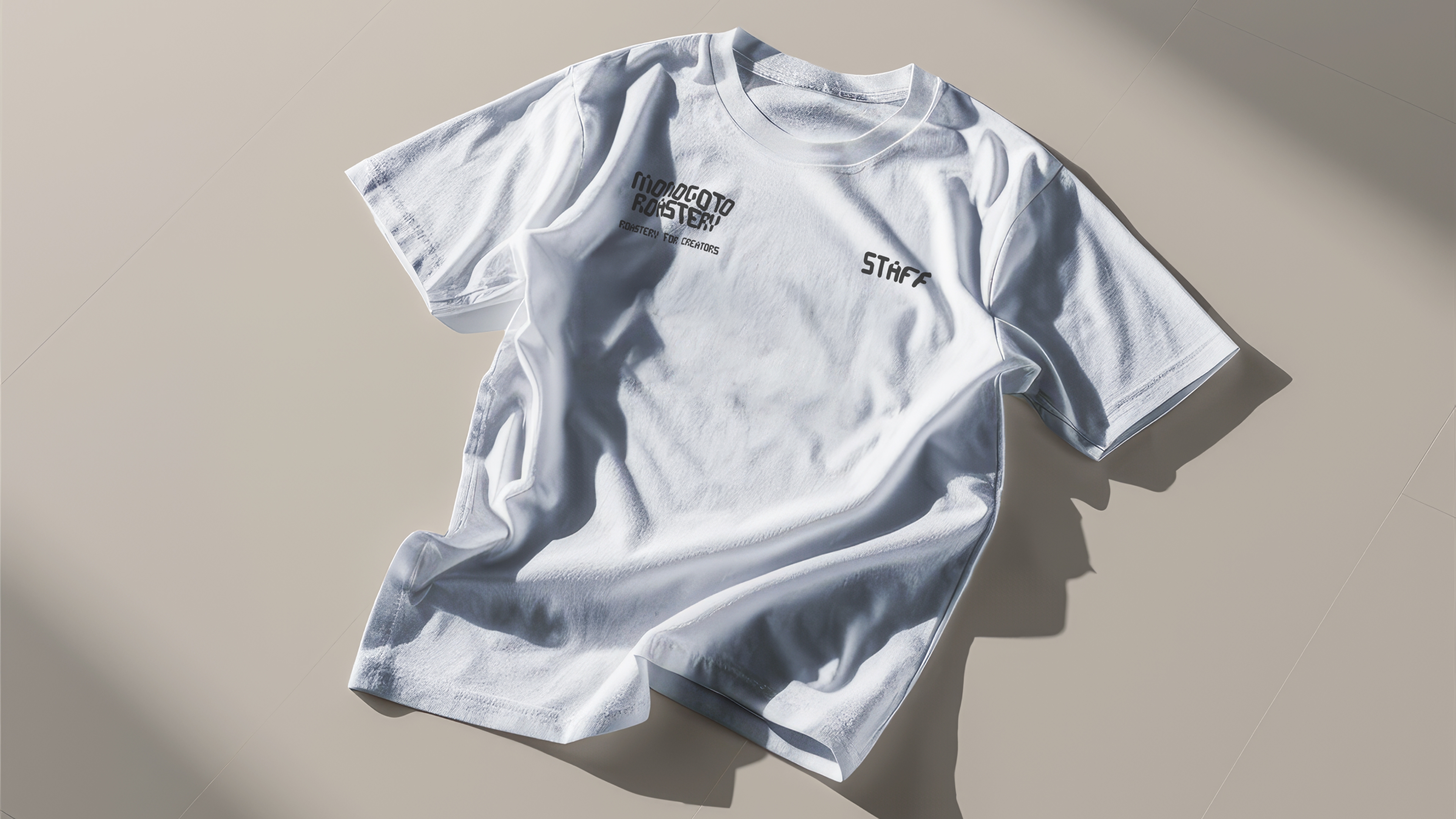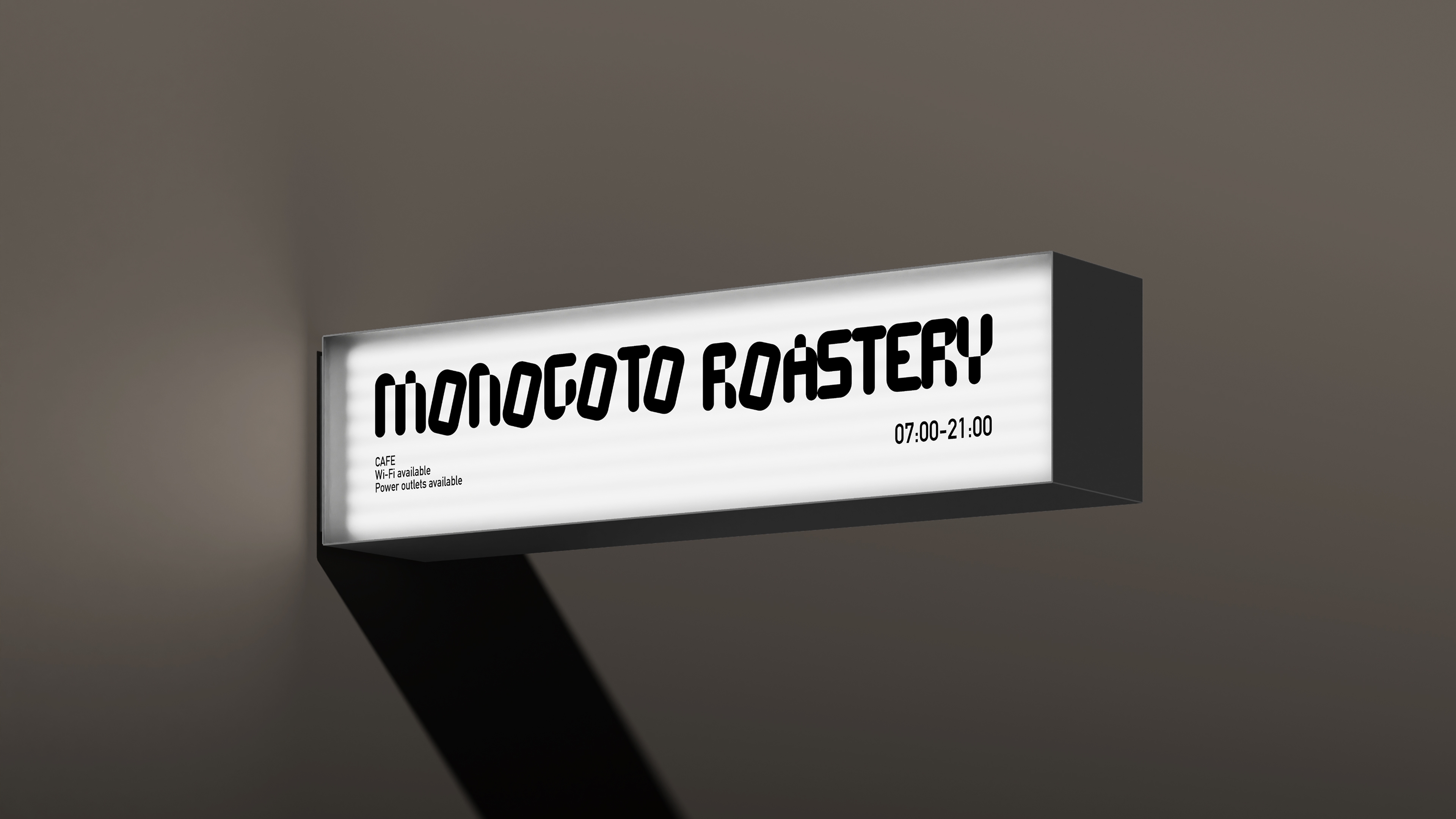
A brand proposal for a Tokyo cafe targeting creators, conceptualized as a place to refine and elevate MONOGOTO (thing). We handled everything from creating an original font to developing tool imagery. The font is a dot-based slab serif typeface. It was designed to be distinctive yet systematically composable, enabling creative expression while also serving as a visual identity. Noting that all vowels in MONOGOTO share the letter O, the design systematically expresses the idea of organizing the cluttered nature of things by alternately tilting the O with the consonants.