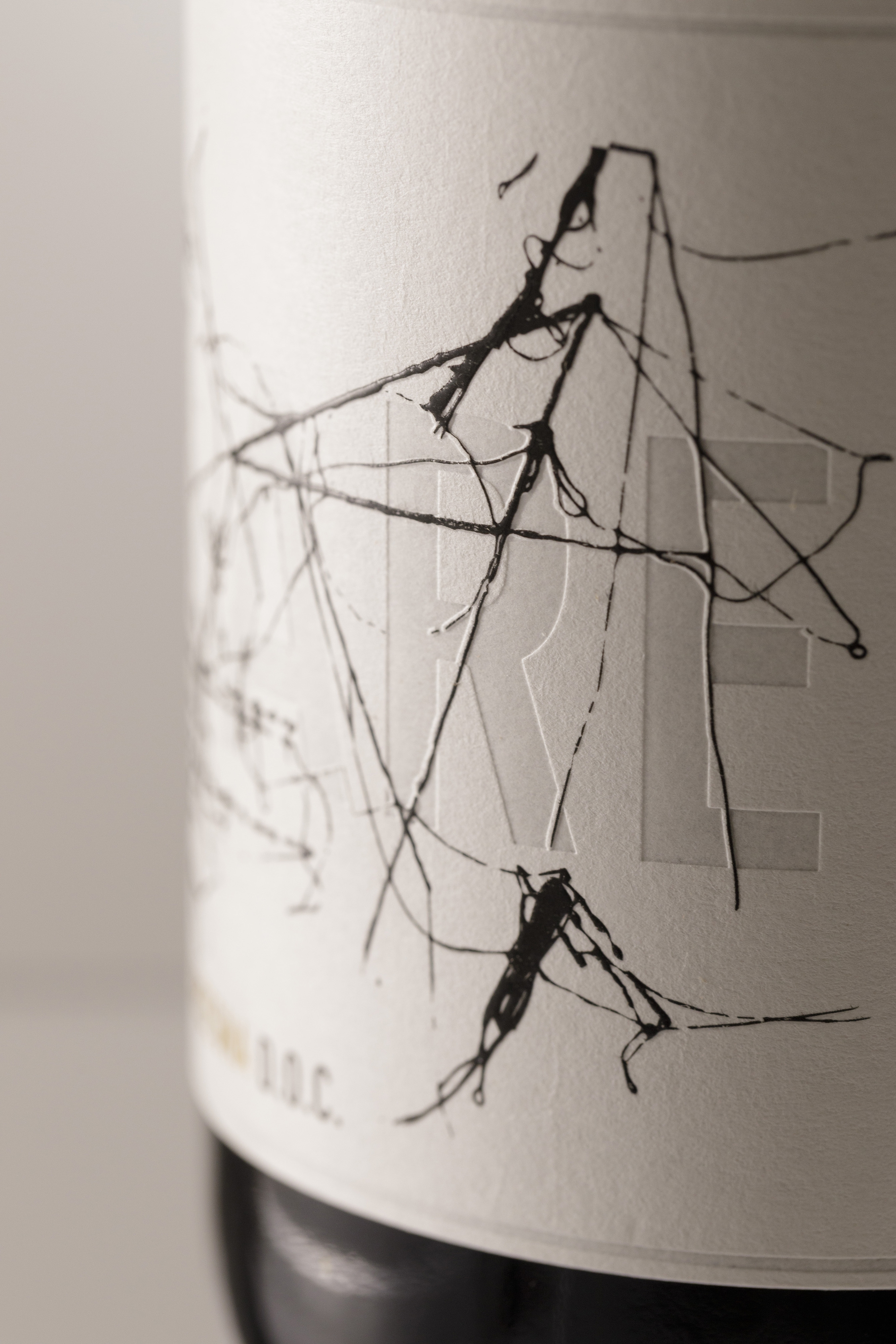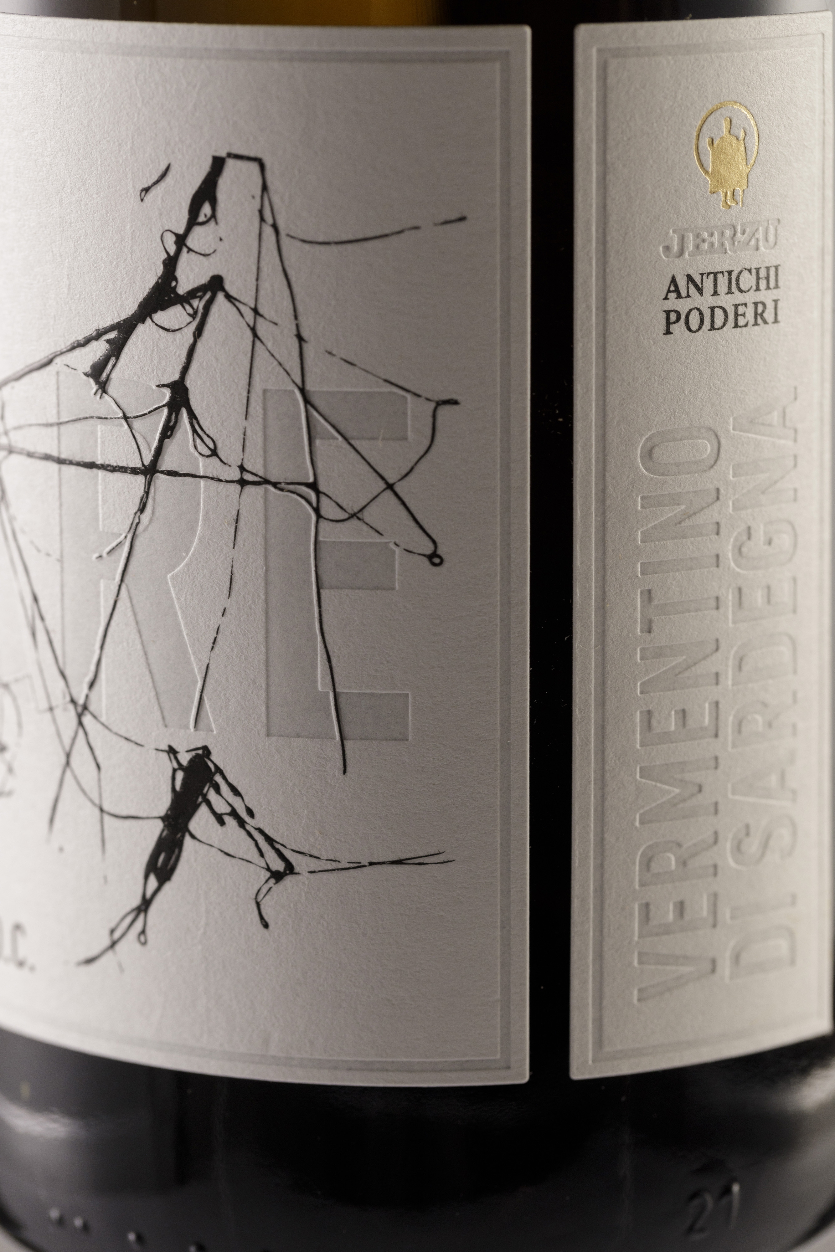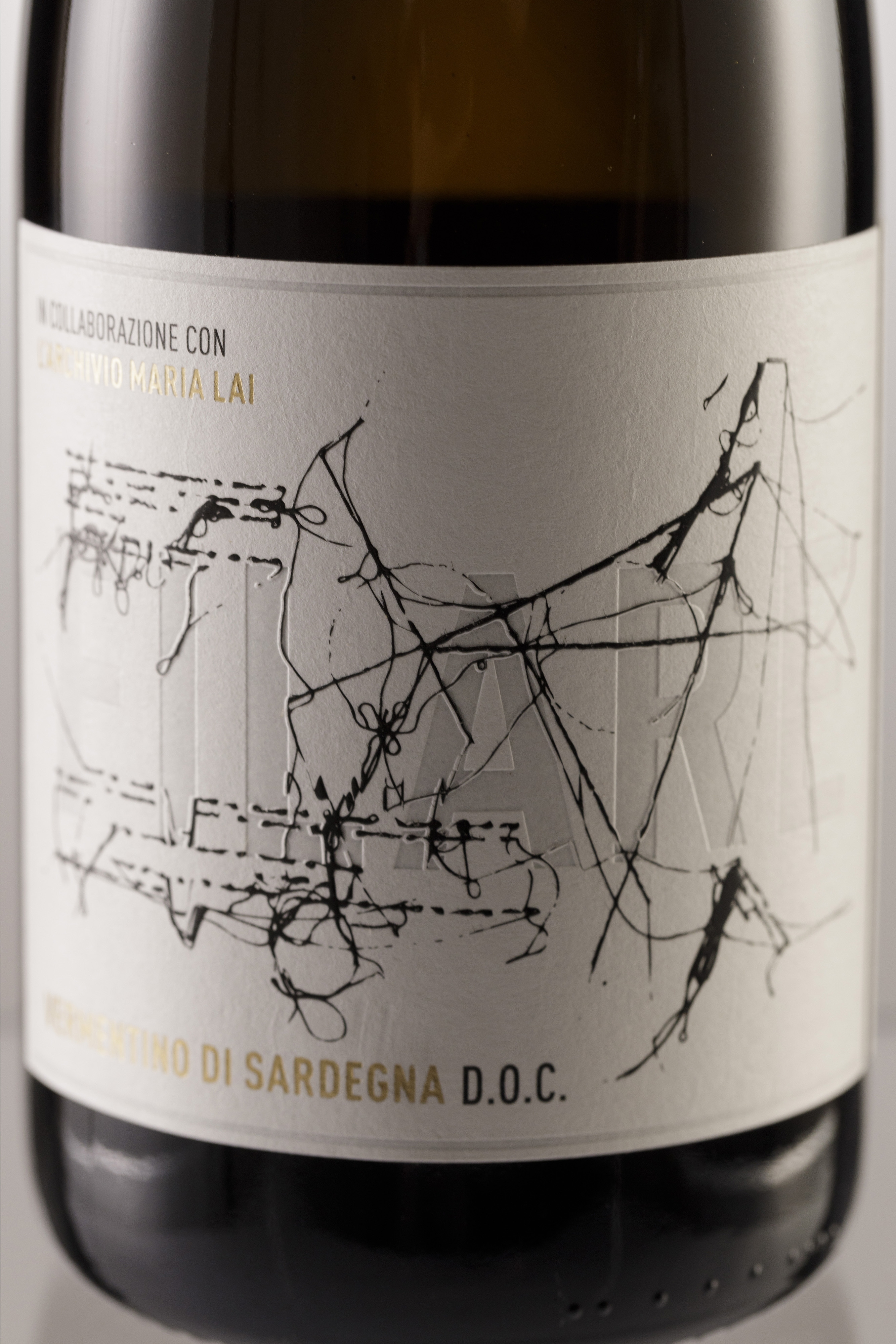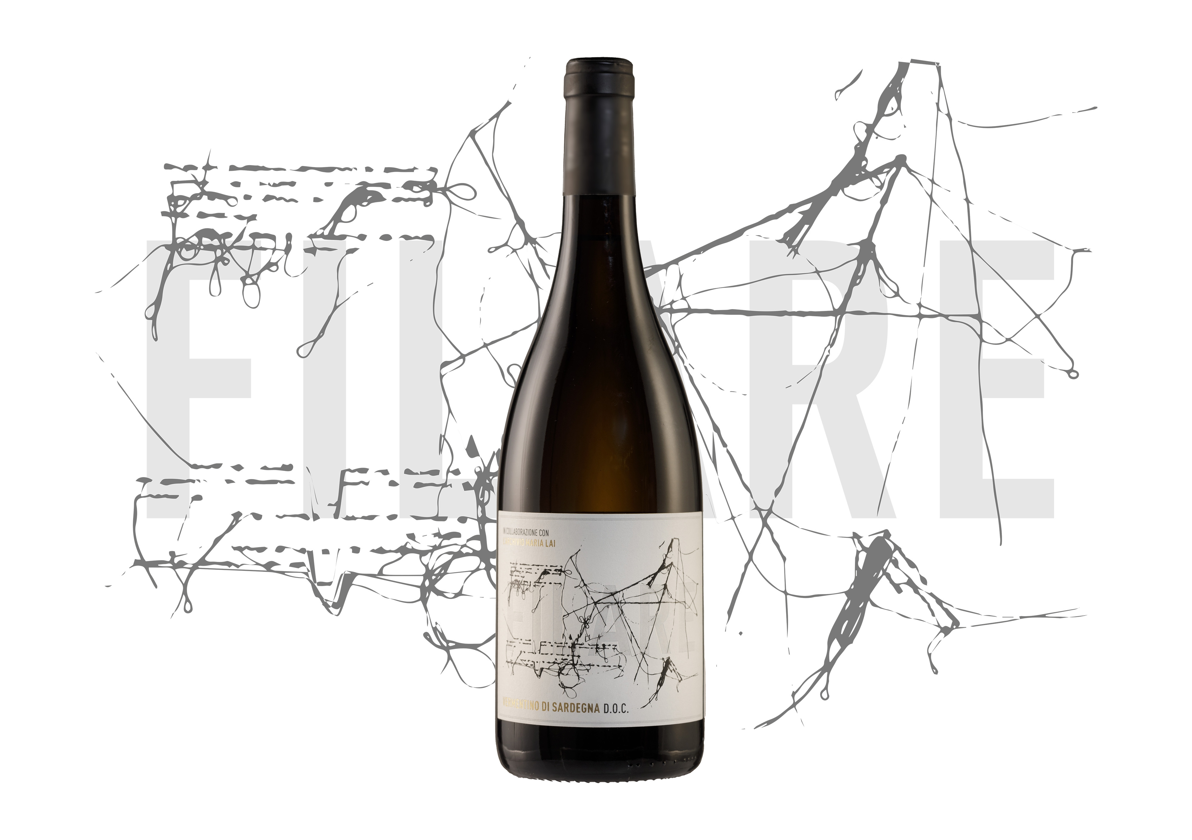
The Filare packaging stands out for its refined conceptual depth and cultural coherence. The project transforms the bottle into a narrative object, where the dual meaning of its name—sewing and vine row—becomes a powerful design metaphor.Through a tactile label inspired by Maria Lai’s iconic weavings, the packaging bridges art and agriculture, memory and landscape. The materiality of the surface evokes both human gesture and collective labor, rooting the object in Sardinian identity while expressing a contemporary design language. Filare brings wine packaging into a sculptural,symbolic object.