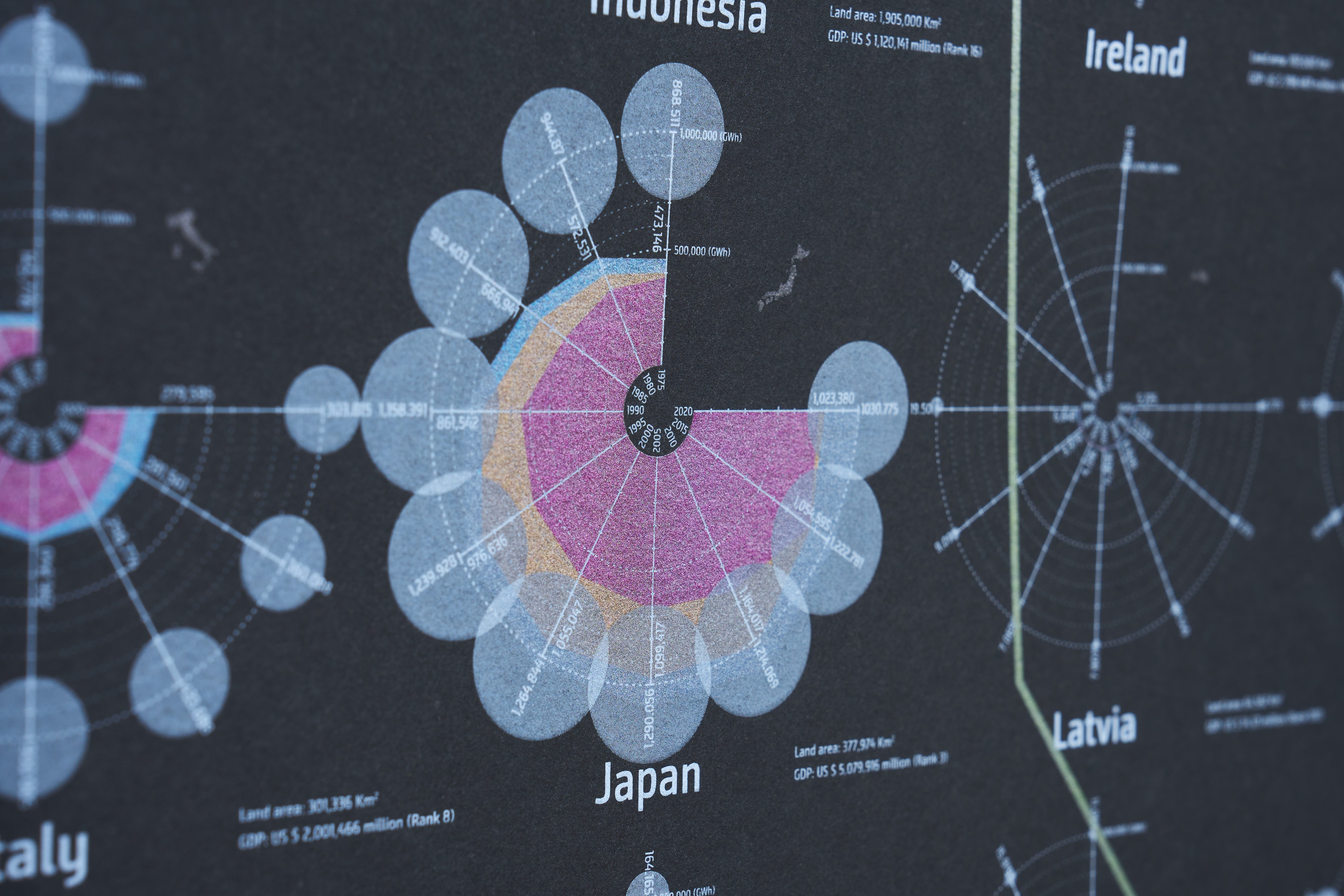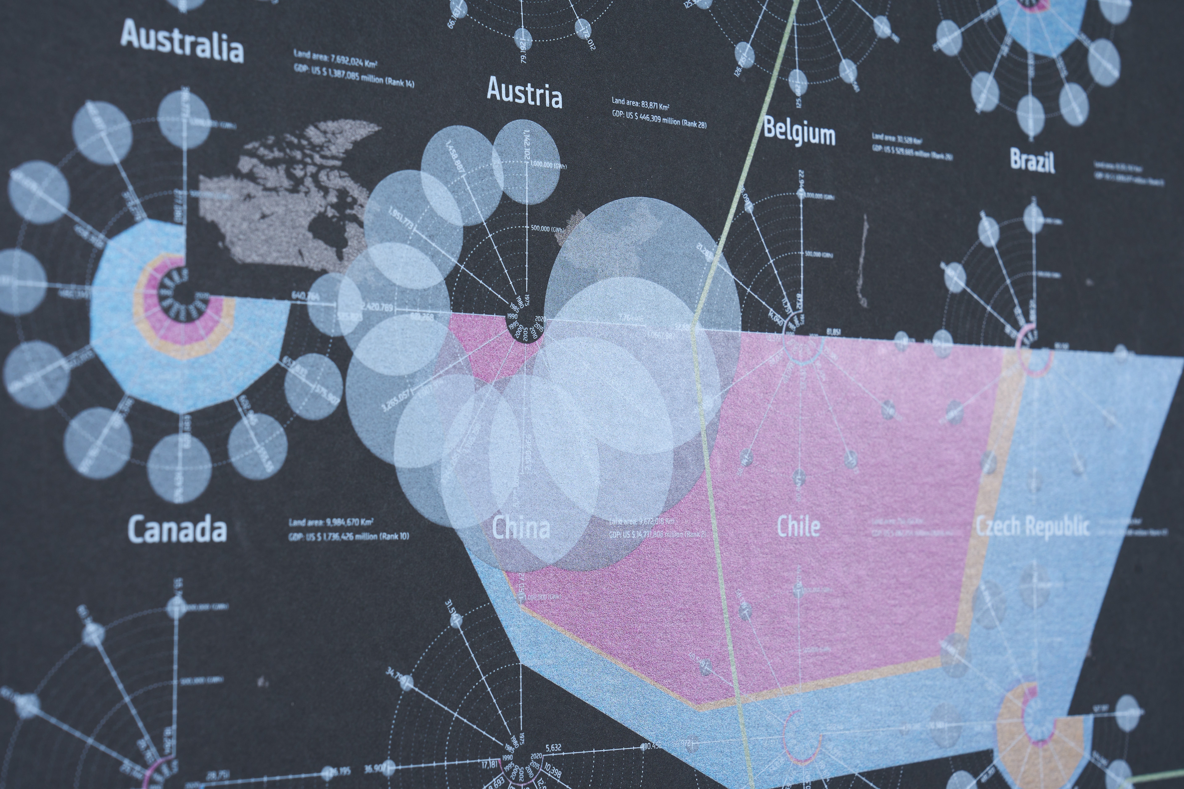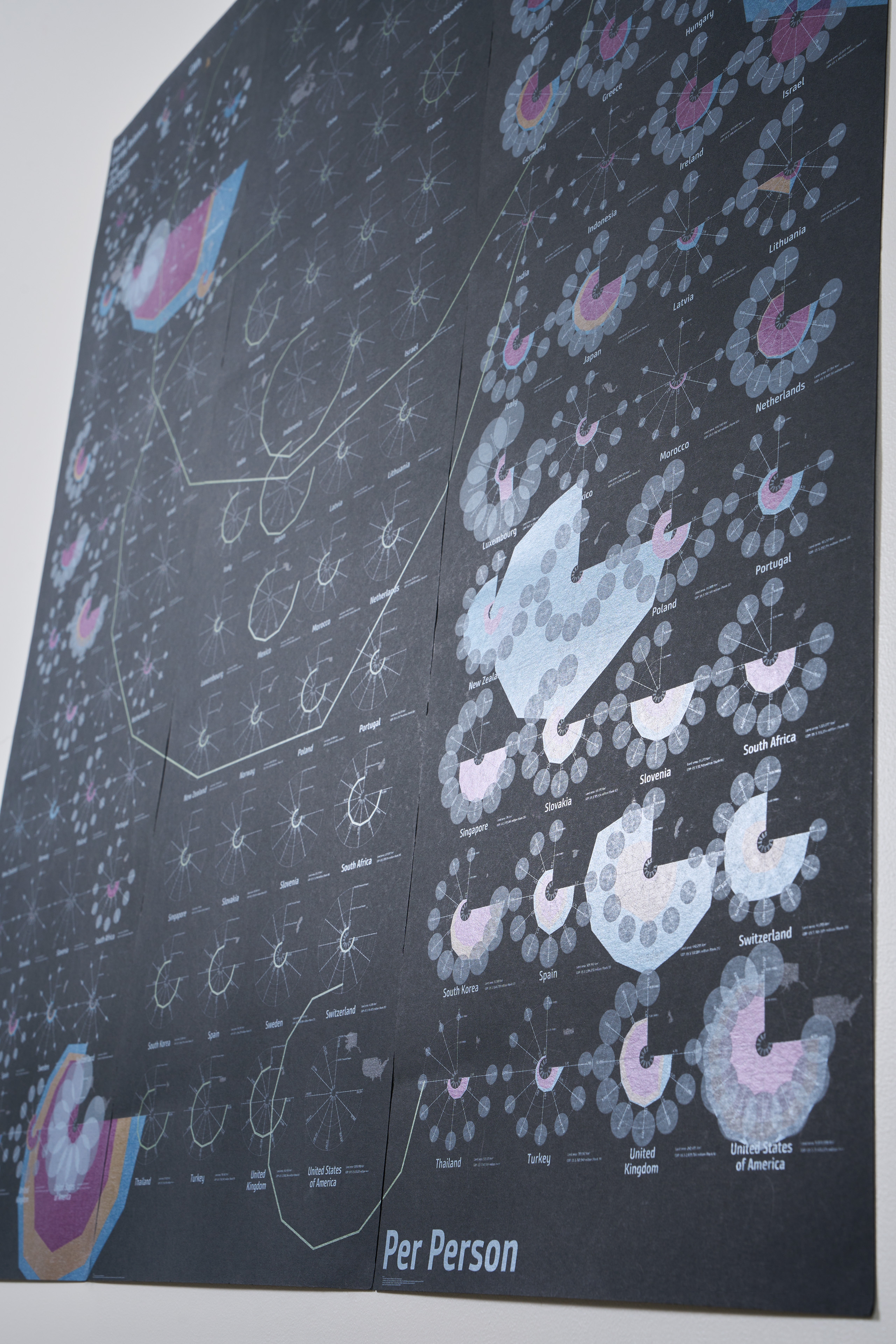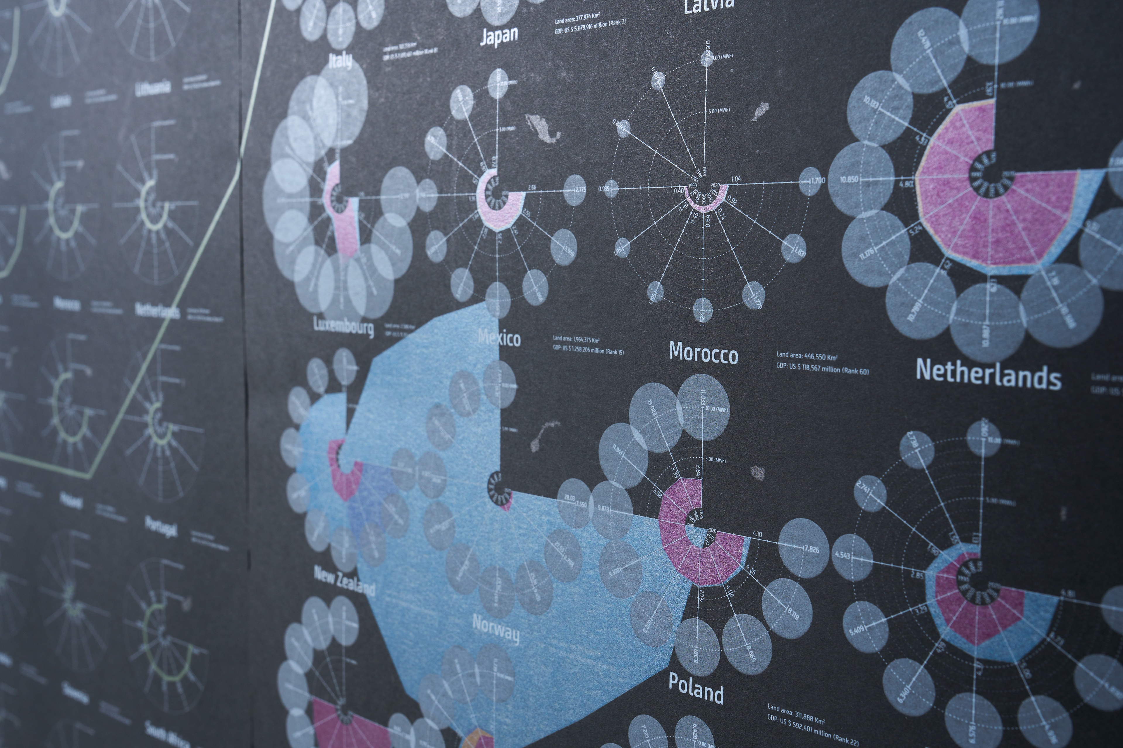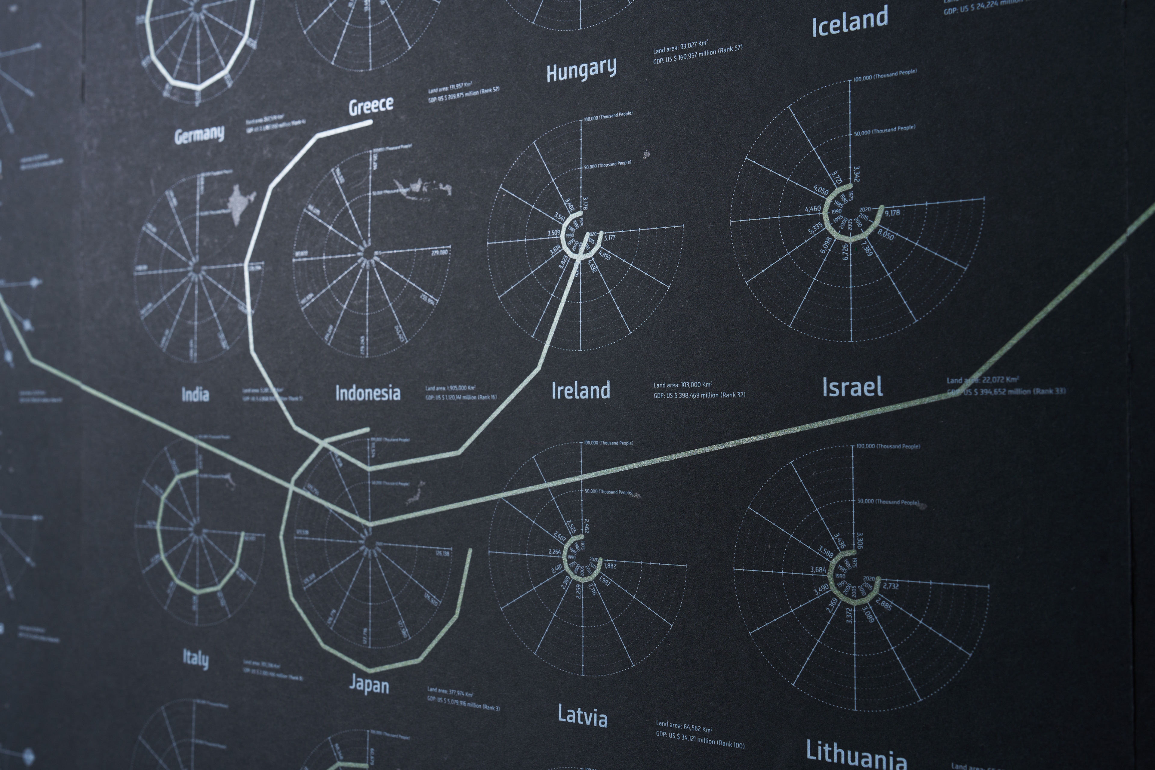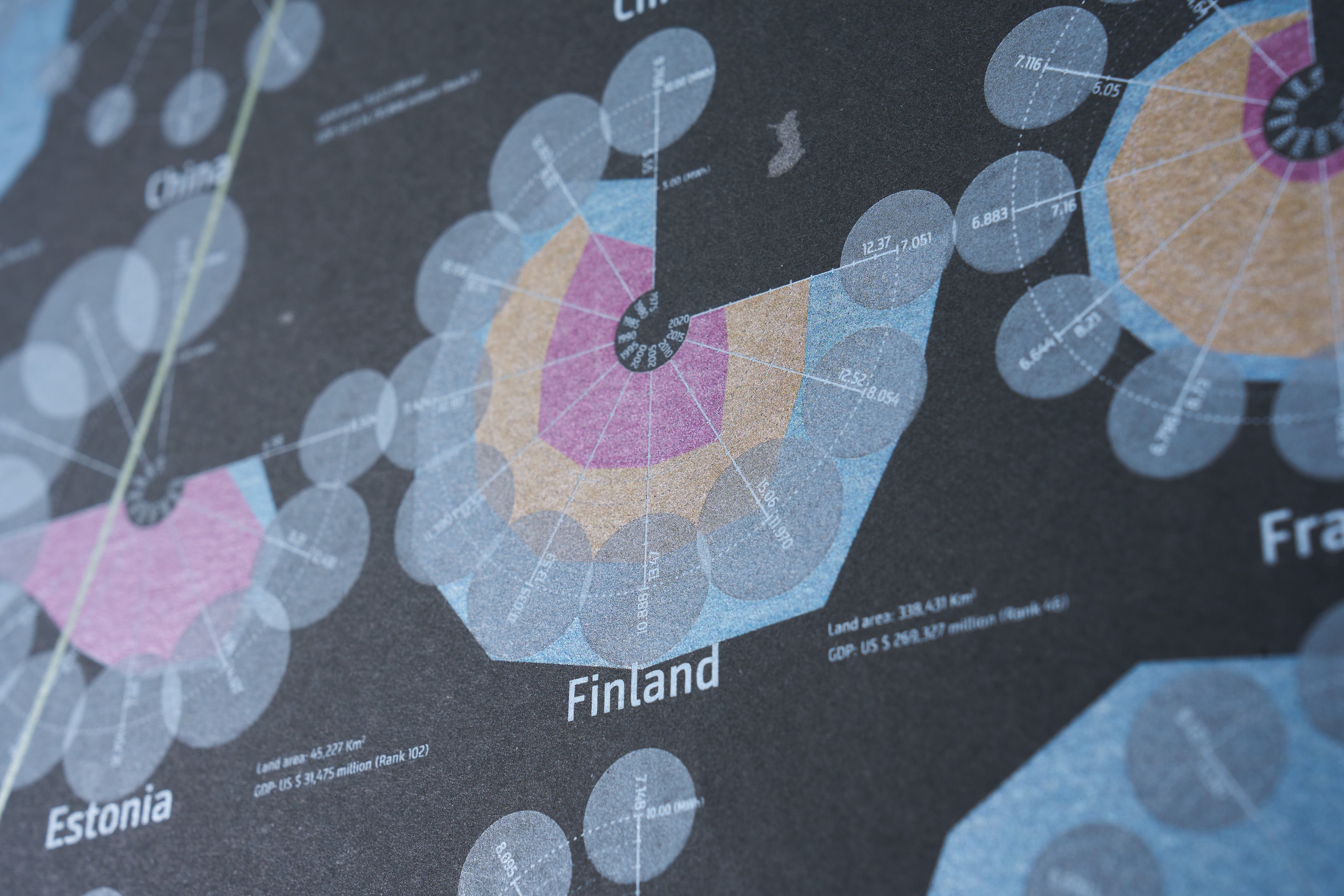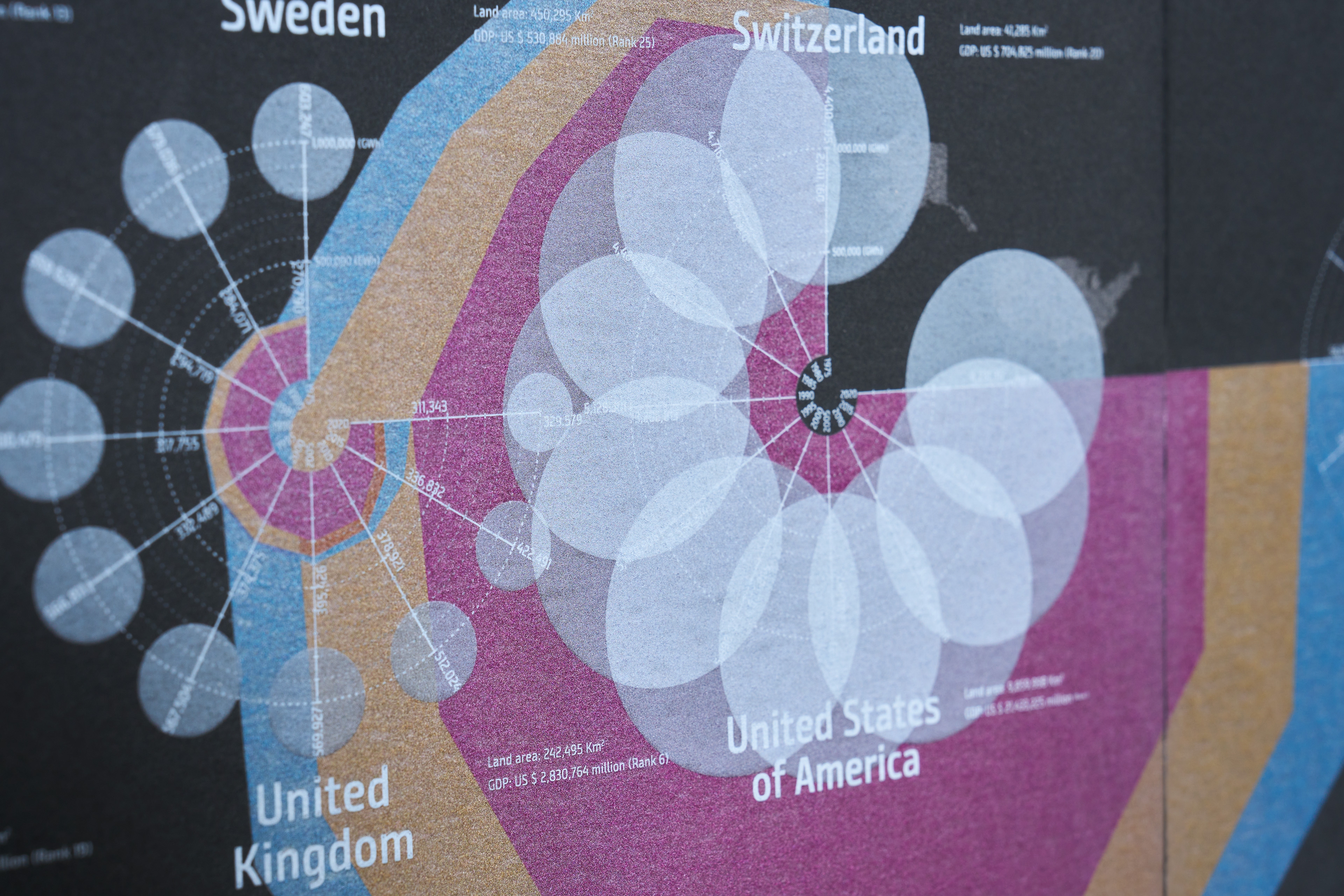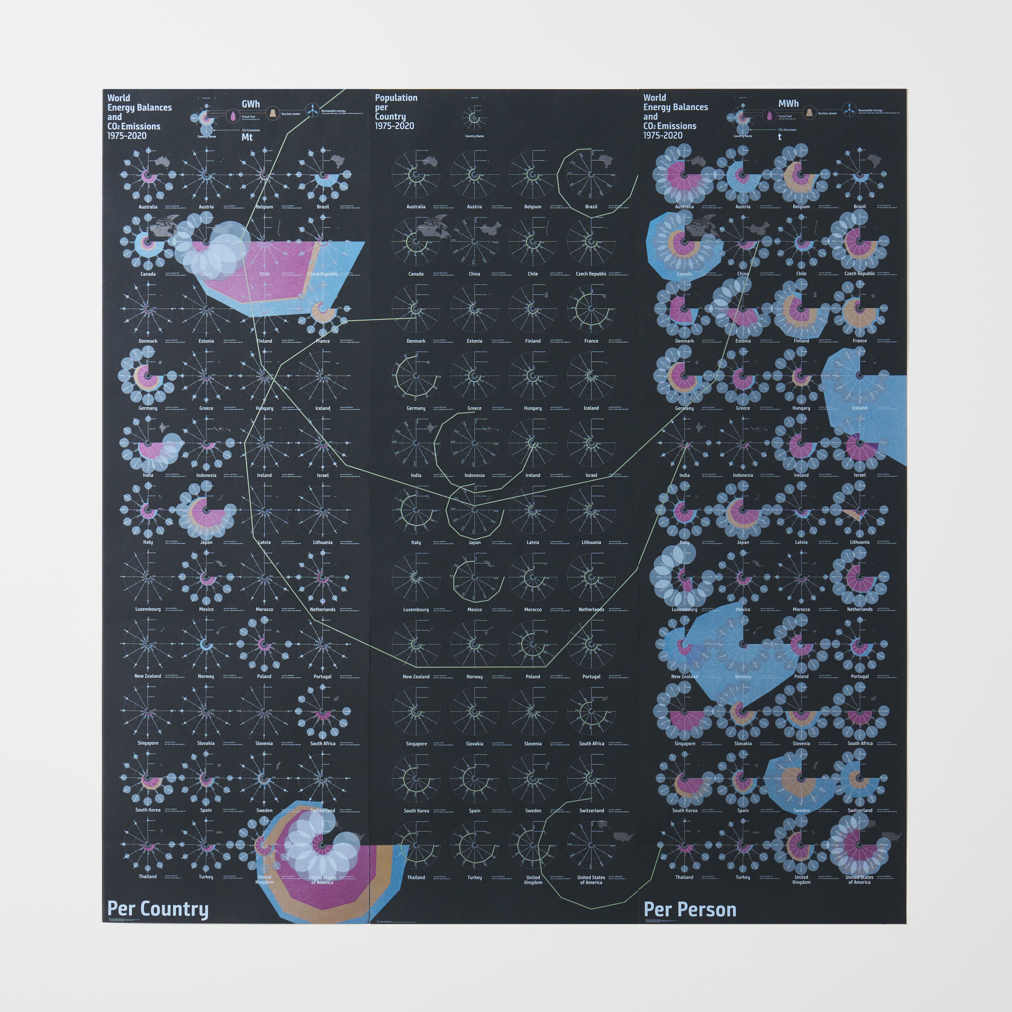
The page 1 diagram shows the electricity generation and CO2 emissions from fossil fuels, nuclear power, and renewable energy sources in five-year increments from 1975 to 2020 by 44 countries according to International Energy Agency. Based on the population trends on each country depicted on the page 2, the page 3 looks into the same data from per capita perspective. The diagram offers new insights with showing the same data from different points of view: national and individual. The print was done in four colors over silver ink, with a transparent white ink overlaid.