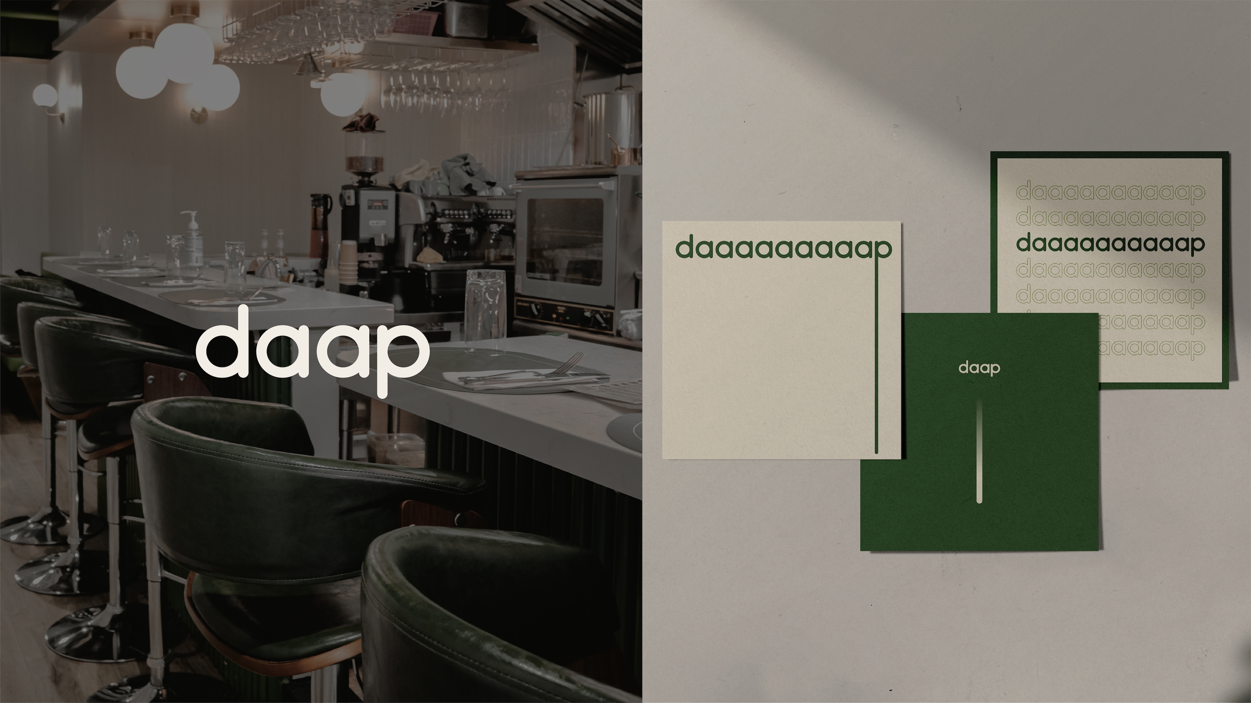
daap is a restaurant located Hong Kong, with a strong dedication of creating the most authentic fusion dishes. The brand name came from the Chinese character “㗳”, with the pronunciation [daap1], which refers to taking time to experience taste. The more you "daap", the deeper you get. It’s all about the "daap-th". Like gradient, color gradually changes as it goes by. To bring up the "daap-finition" further, Welvermind has crafted the brand's visual identity design from scratch - from creative & art direction to logo & a wide range of offline & online applications.