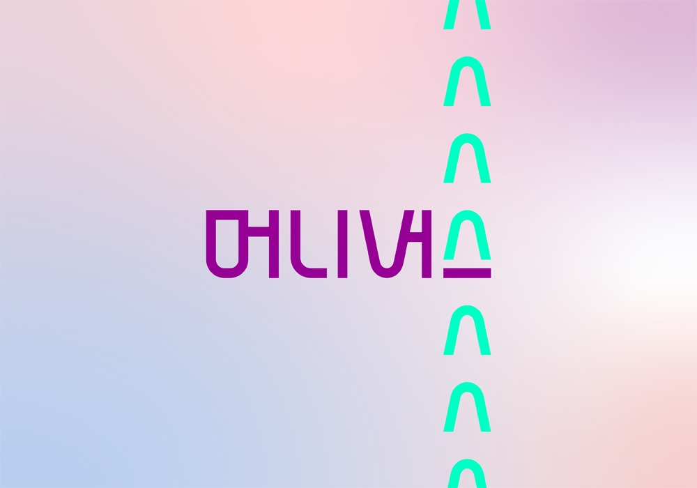
the bread and butter created a Shinhan Bank's fintech service brand called MONEYVERSE, from naming to design. The Korean logotype is based on a coin-shaped circular grid as coins are the foundation of assets. This shape intuitively represents the Gen Z’s asset growth and management experience through the flowing curve of each letter. The color was intended to portray the modern and trendy asset management lifestyle of the Gen Z using royal violet and mint green’s pop color. The mint green’s ‘V’ symbol visually represents the rise in stock value and a happy emoticon.


